The Development of A Cow's Adventure [My First Game]
Day 0 - Conception
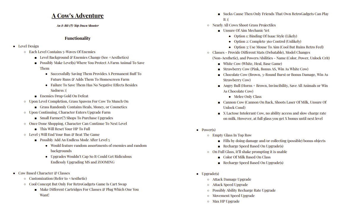
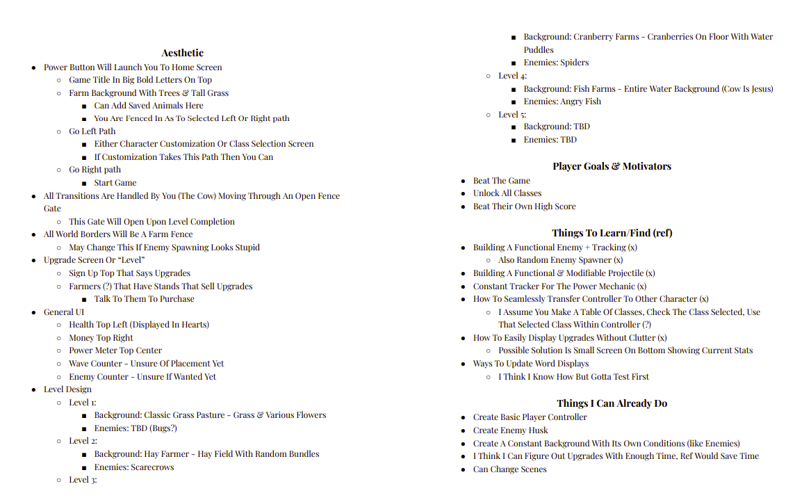
After spending ~5-6 days on Retro Gadgets and learning some of the basics of lua, I learned about this cool fantasy console called Pico-8! I decided to buy it so I could play other people's games and take a look at their code to see if I could figure out how it worked. After a couple dozen games and some reading, I decided I want to try to take my education further and make my own basic game. This is the beginning of Day 0 where I decided to take some time planning and figuring out a game idea. On Retro Gadgets, I had made a very basic "game" where you walked around as a cow and ate grass. I decided to run with the Cow and grass idea but instead of an "open word" I looked at other styles of games. I started by opening a word doc and breaking the game down into essentially 3 core sections; Mechanics, Artistic Choices, & Things To Learn.
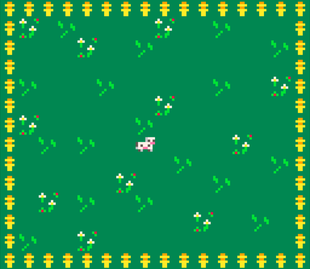
Having planned everything out, I decided to quickly put together a basic layout of the game and learned how to make borders + player controls. It was rough around the edges but I could kinda see the idea forming on how I wanted to execute the game on the Pico-8 system. This was my first map just to test player movement, basic sprites, and projectiles (I couldn't figure this out). I was struggling with some of the mechanics but I had only spent 2ish hours working on it so I decided I'd learn more the next day. Regardless, this was a good starting point and it motivated me since I had SOMETHING produced. The worst part of any project is always getting started.
-----------------------------------------------------------------------------------
Day 1 - Character Controller & Home Screen
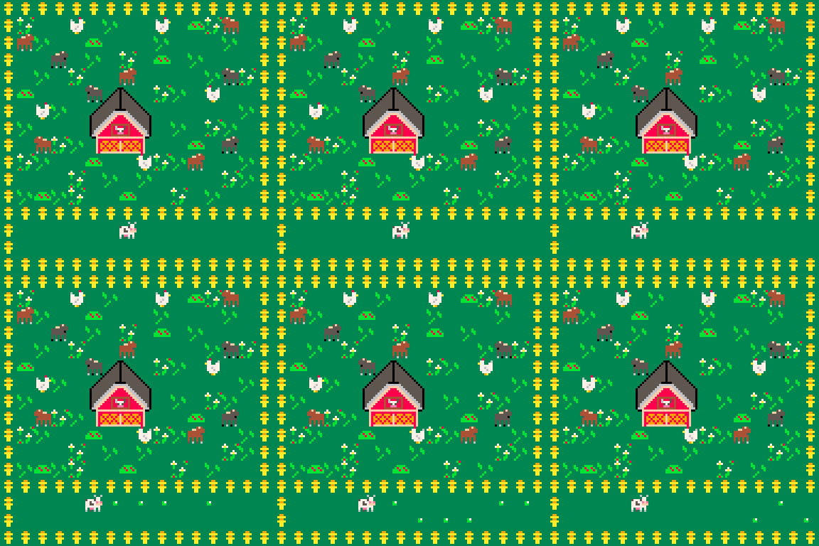
Starting Day 1, I decided to try to work on building a functional character that could move around and then shoot bullets. After failing to follow a tutorial, I spent hours tinkering with the code to try to understand why certain things worked and others didn't. I was semi-successful and ended up with a character that could walk around and shoot a basic bullet! I say semi-successful because I still didn't know how the sprite loading system worked in regards to borders/collision objects. For now, this wasn't a problem! I had a basic sprite, a background, player movement, player stats, and some shooting. It was time to spice up the home-base and add some extra stuff so it didn't feel so empty so I spent some time playing around with drawing sprites. From here, my motivation to continue on skyrocketed as I now had a "functional" character even if it couldn't actually do anything! I decided my game would work by reloading a new map each time you entered the next stage. I wasn't sure how it would work but I assumed I'd just clear the screen and load the new map on top of it.
Key takeaways for the day were that I learned how to make basic tables (aka track player & projectile stats)!
-----------------------------------------------------------------------------------
Day 2 - Making a Stage & Enemies
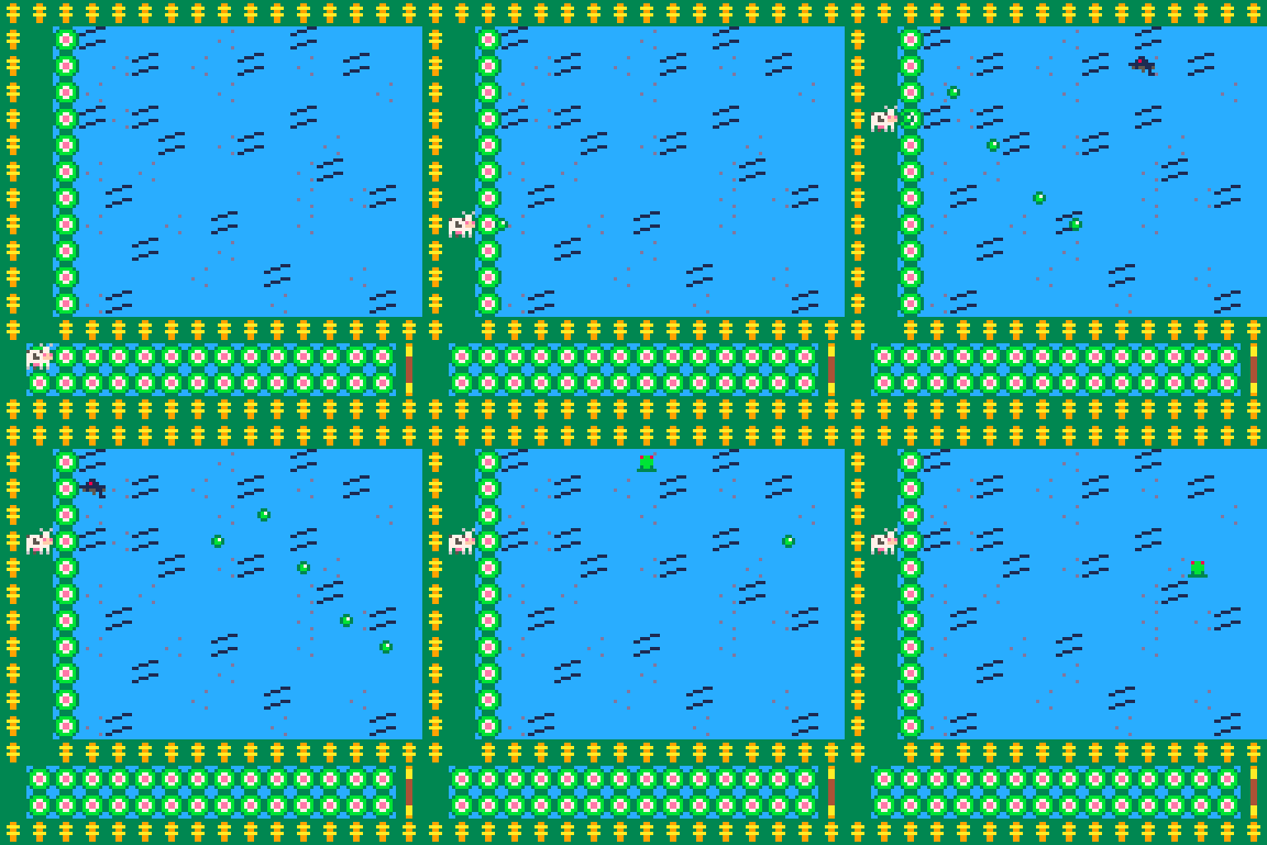
This was a shorter work day than Days 0 & 1 but it was still productive. I decided to take some time drawing out and making the sprites for one of the levels just so I could move my Cow somewhere that wasn't the home-base. Plus, I wanted to work on my enemy models for a level anyways. This is about the time where I found out that drawing sprites in Pico-8 was incredibly fun since they're basic due to their limited size & colors which I'll spend far too much time on later. With the level drawn we now needed some enemies! I pretty much just copied over the logic from the player stat table but renamed it for the enemies and figured you could just add them to the table whenever you wanted and they'd have their stats. Well... I was partly right. Turns out their stats go in the add function rather than in their own table with the way I had it set up which made a lot of sense. I made a basic enemy spawn by just making it when I press Z it added 1 enemy for testing since I didn't really know how I wanted them to spawn yet.
With my level essentially made, I was ready to experience it! Except, I couldn't go through the opening at first. I had no idea why it was doing this and after an hour of just trying to re-understand the map and collision mechanic, it wasn't adding up. Eventually I found out I could add a hole in the fence on the home screen and it would remove the collision for the level so whatever, its an easy band-aid for now. It was getting late so for my final addition I decided to make it so when the enemies cross a certain x-axis they despawn and you take damage (that you couldn't see yet). This would prove troublesome later but for now, it works! I even added a small effect when you took damage just to make sure the mechanic was working.
Key takeaways from this day was learning how to add to tables and modify their internal values on a basic level.
-----------------------------------------------------------------------------------
Day 3 - Bullet Collision, Map Rework, & Audio Cues
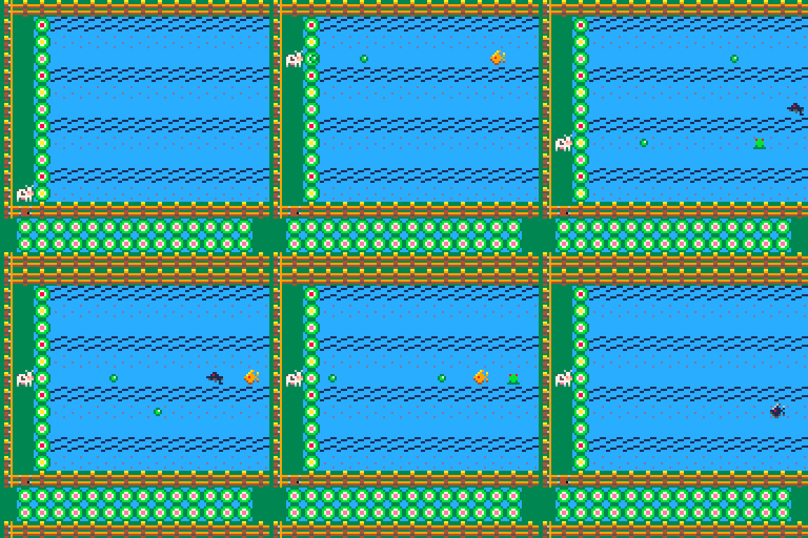
This was another relatively short day so my to-do list was relatively small. I wanted to finally tackle Bullet Collision/Hit-Boxes so that I could KINDA play my game. In theory hit boxes to me are just "when your x-axis is on mine then I take damage" which honestly wasn't too far off. I spent around 2 hours trying to code it myself but I just couldn't figure out how to go about it since Pico-8's init and update functions still didn't make sense to me. After a tutorial, I was able to successfully implement a hit-box mechanic!
Since my game was now playable at a basic "kill the enemy" level, I wanted to add a little more to add some life to it. I took some time adding more enemies, redoing my old fence, kill animation, and worked on basic audio cues for taking/dealing damage, and making a sound when you "die" even though nothing would happen. The end result looked much cleaner! Plus I added "lanes" with the sprites so you could tell where enemies were coming from.
One thing was till bugging me though. WHY DID I NEED A HOLE IN THE FENCE AT HOME-BASE! After hours of trying to learn how the map mechanic and sprite collision worked, I kinda understood why it was happening but didn't know how to fix it. Since I was just essentially loading a new image in the same location, the data that says "this object has collision" would stay there even if the sprite for it wasn't there. So instead of making my stages load on the top of the player, I just added a camera and loaded the entire map on start. Now when you enter the new stage it just moves the camera to it and BOOM no more stupid collision.
Key takeaways from this day were learning hit-box/collision mechanics, camera functions, and the basics of map data.
-----------------------------------------------------------------------------------
Day 4 - Sprites, HUDs, & Animations
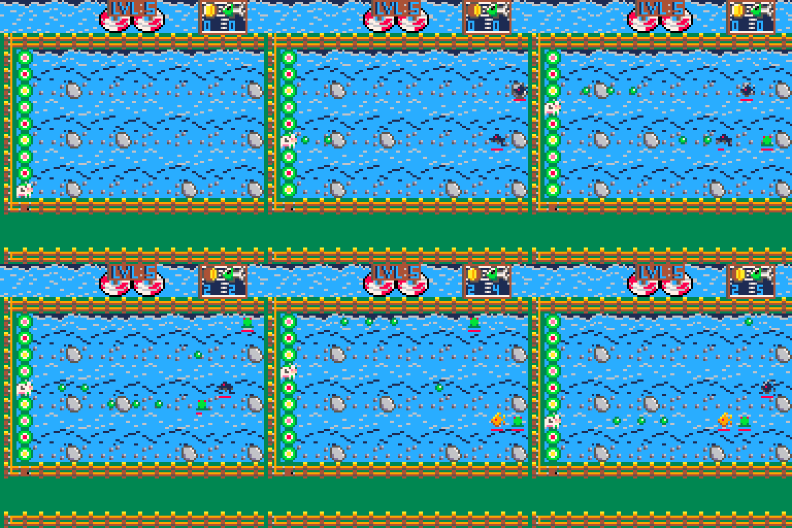
Finally we had a day that I got to work on stuff for more than a few hours! I decided I wanted to pretty much complete the level rather than make the bare bones of the rest which meant I needed to add more actual mechanics to the game! First I wanted to actually make enemies respawn a bit better so I could play the game some more which wasn't too hard to do. The big project of the day was the player HUD so you could track your HP, Gold, and Kills! Making the HUD was actually a LOT more simple than I thought it would be, I just had to do a little basic math to figure out the placement and boom it was pretty much done! Even if it was simple it still took me a while since I experimented with a few different ideas and played with the code to learn a bit more about what I could do with this. Unfortunately the numbers were kinda hard to see so I decided to add some backgrounds rather than just floating numbers.
Now that the HUD was done, it was time to make some sprites to depict each thing and give them a little more life. I ended up making a basic board and realized that my game had a fundamental flaw right now; the enemies were in the way of the HUD. I tried making it so the enemies went over the board instead but it just looked wonky so my best solution was to cut a few rows from the top and turn that into your HUD section instead! This was MUCH easier to read and I didn't have to deal with dumb enemies and numbers overlapping. Plus, the code change for the enemy spawn was super simple.
With the general HUD idea and section implemented I put on some 8-bit music, opened the sprite editor, and just went all out! I added cool new effects, spiced up the HUD, worked on a coin animation with a friend, and overall the level looked AMAZING. It was a little visually noisy which made tracking enemies a tad harder but for now that's okay. I decided I'd likely do a small rework in the future. I didn't fully finish the level but with the HUD and arena done, I was pretty happy for the day! Oh, I also didn't know what to do for HP yet so I just didn't add it but I left space for it anyways. We now had a fully functional level!
Key takeaways for this day were learning how to make a "tracking" HUD/Sprite, basic sprite shading skills, and creative ways of spawning sprites to make them look a bit better/even.
-----------------------------------------------------------------------------------
Day 5 - Menus, Classes, Life, & Death
This was the day that I spent mostly programming rather than making sprites like I was in the previous few days. While the game was functional, I wanted to add some of the basics like a Start Menu, a Game Over Screen, and get started on systems of stat changes. Making the Start Menu wasn't too bad since I just loaded the map, moved the camera around, and locked player controls. It was super basic and wouldn't adapt well later but it was a good starting point for now. For the Game Over Screen, well, it was the same thing except I made it auto-reset the cart after a few seconds since I didn't feel like adding a "press X to continue" mechanic or anything.
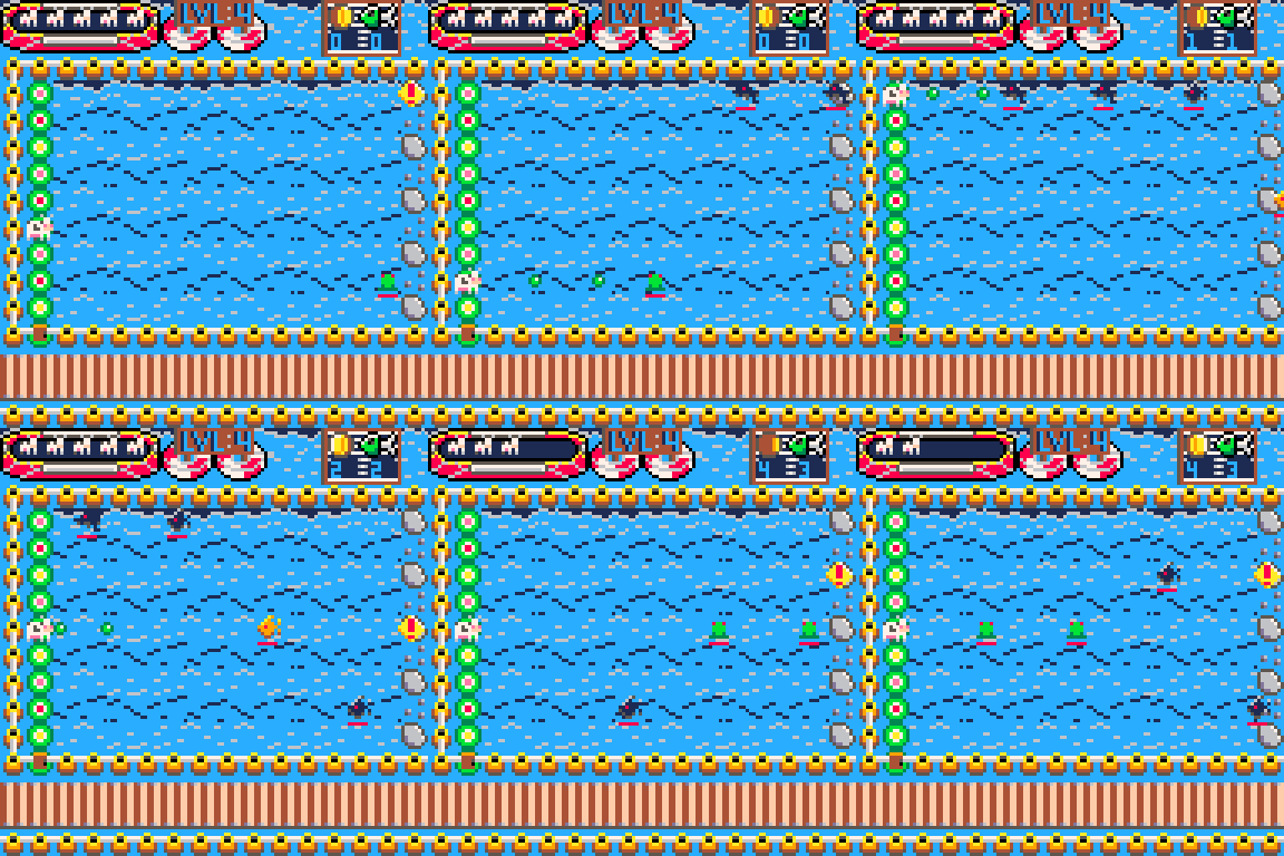
One of the bigger mechanics I worked on was the addition of a "warning" sign where an enemy is going to spawn! This helped a lot with visibility so I was pretty happy about it. I scaled it with the enemy movement speed so that the faster they were, the slower the warning was. Seeing this, I realized my bullets should probably do something similar. Shooting 100 bullets per second at the same speed as when you shot 1 was pretty dumb so I implemented the same mechanic between attack speed and bullet movement speed. Testing this meant I had to have a way to increase stats so I made a basic system that would hot-swap stats for me (which means I now had a basic structure for my Classes & Upgrades)!
While I didn't work on too many things visually, I REALLY wanted a health bar so I decided on some mini-cows! On top of this, I decided each level would "hold" your cows in a different way. So I built them a raft for the water level which was pretty fun to do (this ended up being my favorite of all the levels). I also figured that the explosion kill animation looked stupid so I decided to make level specific ones; in this case, they sink! The grass and wooden fences felt out of place as well so I made level exclusive sprites to make everything blend together much better! I changed a few noises and did some basic battle music and was done! This level was now in a fully playable state and could technically be its own pointless little shooter! From here, the game needed a few small mechanics, and some QoL changes to be finished. Well, besides drawing the other levels that is!
Key takeaways for the day were learning to make basic menus, refining camera control/map spawn, better shading on sprites, and better table update mechanics.
-----------------------------------------------------------------------------------
Day 6 - New Level, Realizations, & Experiments
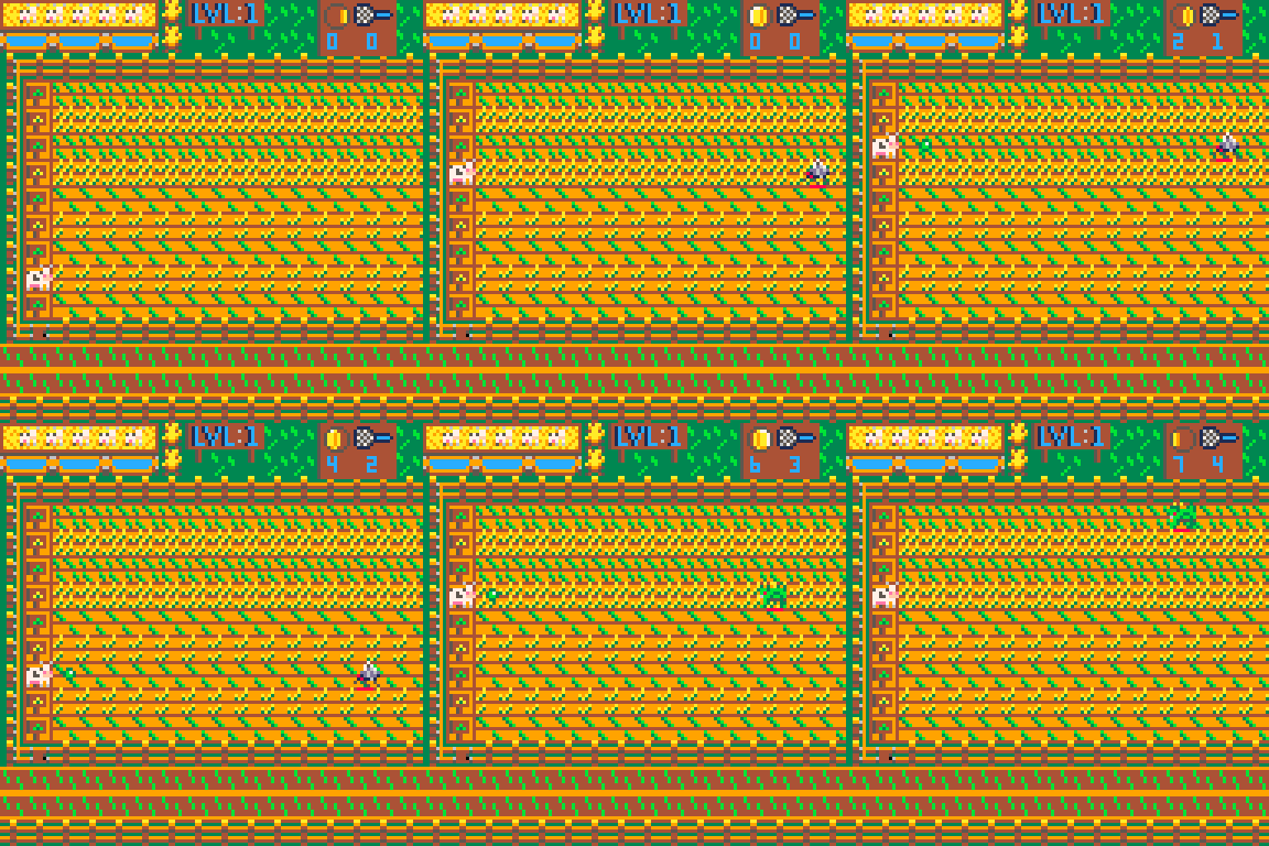
At this point in the development process, I was antsy to finish and publish everything but to that, I had to finish my levels and finalize my systems. So, I spent this day developing one of the levels and slightly adjusting some things in our previous water level. It was a lot of sprite work since most of the mechanics were already done so I just put on some music and got to drawing! After finishing all the sprites for this level, I did realize one thing though. I was actively running out of room on my sprite sheet.... The levels had a bit too much detail with too many unique sprites which meant I may not have enough room to make all the levels I wanted. I also noticed that it was kinda hard to track the enemies because some of the arena floors were too noisy and packed (they were pretty, but not functional). So I tested some different floor sprites and decided I'd come back to it tomorrow but knew that I'd likely cut some detail from every level overall and that I'd reduce the amount of things per sprite if possible. It was sad but it was necessary.
I wrote down some plans for the other levels, making enough room to make at least 2 more and if by some miracle I had enough room, I could develop an extra. On top of this, I started drawing out some basic ideas of what I wanted my start menu to look like, what features it would have, if there would be game modes or difficulties, etc. I decided for upgrades, you'd have a small menu you could access with buttons to purchase stuff. Your damage would also change the color of your bullets but I wasn't quite sure to what yet. The next day was going to be the final run to finish the entire project and upload it for my friends and strangers to play! It was going to be a lot of effort but I was nearly there.
Key takeaways for the day were learning how to reduce visual noise a bit
-----------------------------------------------------------------------------------
Day 7 - Final Mechanics & Level Development
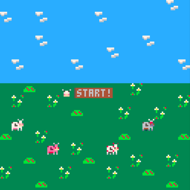
We finally made it to game completion day! I spent the entire day working on the final few mechanics of the game and a LOT of new sprites since I had to finish levels 2 and 3. I started out by figuring out how to create a controllable Selection thing for the Start Menu as well as adding Difficulty Options and Character Selections. The Selector was easy cause it was pretty much just a character that moved in set intervals as for the Menu options, those were just static sprites that would spawn in and out depending on when you pressed X.
With the menu added, I just needed to make their buttons actually do stuff instead of only advancing to the next screen so I worked on the way my game launches. Working on this was fundamental to the game because otherwise it would load EVERYTHING at once which would be a hassle for music, controls, sound effects, etc. This was a bit weird since some things wouldn't initialize when I wanted while others did and sometimes things would just break but with some testing I figured it out. I also pre-emptively made a few QoL systems to save myself some work/effort for things like changing music or scenes whenever I wanted. For the different difficulties I added a function that would keep track of your difficulty and scale the stages by a certain % which would make everything a lot easier as I finished the game. If I had time, I would re-do this by completely reworking the way my stages worked so that certain things could be scaled individually rather than the entire stage at once. To finalize my menus, I had to work on my Upgrade Menu which was fairly easy. Just "pause" the game state using the new stuff I used to launch my game, swap it to Upgrades, move the camera, and give your player a new controller. Since I already had a stat change system in place, this was easy to do. As for my classes, I just made it so when you select a class it'll adjust your stats accordingly before loading your character. It was also simple enough although could be a bit smoother had I reworked my player stat loader but meh.
Now that the Start Menu was fully functional and upgrades were out of the way, it was time for some music and sprites! I reworked my current levels a little bit to increase visual clarity and worked on a ton of new sprites for the 2 new ones I was missing. After some adjustments to colors, enemies, and overall theme, everything was done within a couple of hours! Oh, I also made actual Cow Class sprites instead of the placeholder cow I before. The day was coming to an end and the game was done, but I wasn't satisfied just yet. While you could *play* the game, it just felt empty still and was missing some small QoL and other changes. So, I stalled launch by 1 day and got to work.
Key takeaways for the day were learning to reference functions easier/cleaner, game state creation/management, and launch optimizations.
-----------------------------------------------------------------------------------
Day 8 - Bug Fixing, Balancing, & Polish
THE FINAL DAY! I was dedicated to releasing the game on Day 8 so I got to work early. I already knew everything I wanted to do so I broke everything down into a to-do list separated by bugs, balancing, pretty visuals, pretty sounds, and pretty music. I tackled any bugs as they appeared during play testing so there's not much to cover there. There are also weren't many to begin with since I play tested at least 20 times a day to make sure everything ran well after small changes (inefficient ik...).
When it came to balancing, I was in over my head but I was committed to making the game feel relatively balanced for every class at every stage. I kept getting a perfect balance for my base class but then 1 change would spiral and unbalance the entire game. After suffering for a few hours, I decided to go about balancing in a much more precise route. I won't add the math and stuff here but I eventually made the base game balanced for the base class then adjusted each value by a certain % so that everything scaled together properly. While this method of balancing isn't good in games with high upgrade numbers and length, it was pretty perfect for what I needed since all classes should be somewhat even anyways. From here, I just kept slightly adjusting values and percentages until the base game felt "right". Then I just scaled the difficulty again and tried each run about 10 times before confirming its what I wanted. It was a painfully long process that could have been avoided/mitigated had I taken more time to plan my HP and damage system but you live and you learn.
With the game fully balanced, it was time to add some more effects and slightly change a few of my sprites. Nothing too crazy was added here since the game overall felt relatively fine. The big changes come in terms of the audio! I added more SFX to general player interactions like moving the menu, confirming selection, buying items, etc. Now the game was still missing a little bit of noise since all you could hear were sound effects and a basic battle track I made. I tried making my own music for about 2 hours to no avail so I looked for some free music for Pico-8 and implemented it from there. Saved me a ton of time and FINALLY added some life to the game. From here, I just did my few final runs before uploading and, well, the game is done!
It was a relief to finally be finished with the game and overall I was happy with my final product. There were a few things I wish I would have changed but this was meant to be a learning experience more than "my ultimate creation". I learned a TON while developing this and I now know different and more efficient ways to do something similar. I could probably remake the entire game in about half the time with 20% less code now. I still have a lot to learn but I'm glad to have done this. If you made it to the end of this, wow I'm shocked you read this! I mostly wrote this down so I could look back on it in a couple years. I hope you enjoy the game and enjoyed reading my short but fun experience with this. Also, if you love 8-bit and want to easily learn to code a game, PLEASE check out Pico-8. This software is like $15 and is worth every penny. I mean I legit didn't know lua less than 2 weeks ago and we're here with a little help and some motivation to learn. Anyways, that is all! Have a good day <3